Matte
A low-shine appearance for detailed illustration, clean typography, and understated color. Evaluate a physical sample alongside your artwork.
Compare the look of matte, gloss, and specialty print effects, then choose the film structure your pet treats and packing process need.
Request finish samplesCustom printed. Starting at 500 pieces.
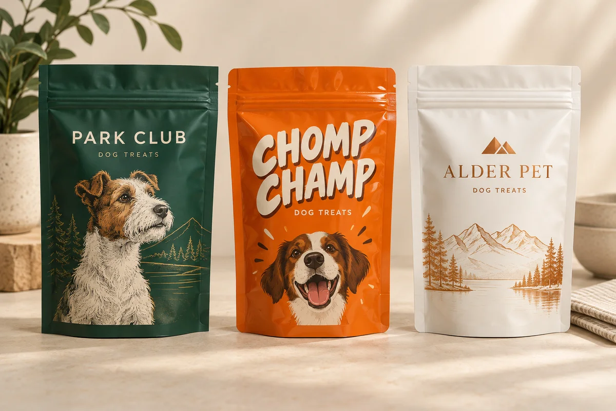
The surface finish changes the look and feel. The underlying film structure is selected separately for your product and packing requirements.
A low-shine appearance for detailed illustration, clean typography, and understated color. Evaluate a physical sample alongside your artwork.
A reflective appearance for vivid graphics and saturated color. Consider glare and how the package will be photographed or displayed.
Discuss soft touch, metallic accents, and selective gloss. Availability and artwork setup are confirmed for your selected construction.
Color panels illustrate visual differences only. Request a physical sample to judge a real printed finish.
“Matte” describes an appearance. “Clear” or “metallized” describes a different aspect of the material or print construction. Your quote should make both clear.
| Decision | What it changes | What to tell us |
|---|---|---|
| Matte or gloss | The surface appearance of the printed pack | The look you want and whether you have a reference sample |
| Clear window | Where the product is visible through compatible clear film | Window shape, placement, and intended product visibility |
| Metallic appearance | Where the base can show through the artwork | Which areas should look metallic and which should stay opaque |
| Soft touch or spot effect | Tactile feel or selective visual contrast | The desired effect; compatibility and cost require confirmation |
| Barrier film structure | Product protection and packing compatibility | Product, process, storage, shelf-life target, and co-packer needs |
Special effects work best when planned deliberately, not applied after the file is finished.
On clear or metallic constructions, white ink can affect opacity and the appearance of printed color. Mark the intended opaque and transparent areas clearly.
Use contrast for flavor names and product information. A metallic or reflective effect should not make the main message harder to read.
Use clearly named layers for windows and spot effects, following the production template and file instructions supplied for the job.
Screens show color and shine differently from printed film. Evaluate samples in the environment where your product will be seen.
Look for glare, legibility, and whether the artwork has the intended contrast.
Evaluate feel and handling rather than choosing only from a rendered image.
Compare flavor colors and repeat design elements together so one finish supports the whole brand.
Ask about selective gloss or other specialty effects. We confirm compatibility, artwork setup, and pricing for the selected construction.
Surface appearance alone does not establish barrier performance. The film structure and seal specification must be reviewed separately.
Do not assume every finish, window, structure, and format can be combined. List the desired options so we can confirm a workable specification.
Describe your brand style and request sample options. Compare the real material and print finish before approving the job.
Choose what you know. Select “Help me choose” for anything undecided, and our team can help work through the specification.
Your request starts a conversation. It does not place an order or commit you to production.